3 things to remember while analyzing mobile UI requirements
Analyzing UI requirements is the first step towards creating a high end user interface. Being a developer, I have received a list of UI requirements many a time, which made little sense to me. In such cases client’s requirements would be met by constant iterations and evaluation during the development process.
That said, let me share with you three most important problems that most developers face during UI requirements:
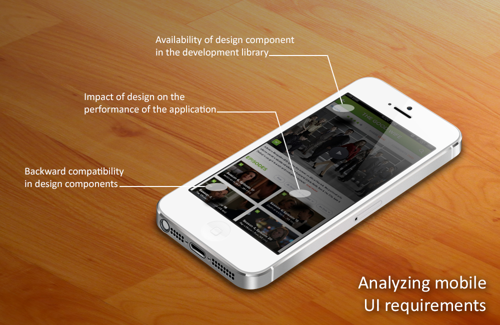
1. Availability of design component in the development library:
Building UI components from scratch doesn’t always ensure proper functionality; especially when you intend to launch for multiple devices.
A major problem occurs when the library you’re using doesn’t have the necessary UI component. This might lead to some extra work even when the requirement is quite simple. Furthermore if the component functions improperly on certain devices, things go haywire. All this increases mid-project complexity and you struggle to meet the deadline.
So I’d advise my fellow developers to keep one thing in mind. If the requirement is for a particular library, always look for the available UI components within, before you start designing. This saves you from wasting both time and effort and makes sure you’re always on schedule.
2. Impact of design on the performance of the application:
While designing an application, you cannot wrap up every little aspect on a single page. One needs to know how it affects the performance of the application. If your requirements can be fulfilled by a simple UI, then go for it.
UI designs sometimes introduce on-screen flickering issues which results into a sour user experience. Too many custom components and animations cause this. Heavy designs, which involve lots of elements, make the interface messy and confuse users. Make sure that your design layout is intuitive. Always try to avoid heavy design elements as they bring down the performance of the application.
3. Backward compatibility in design components:
There are times when you need to design an application for current and older versions, of the same software base. Present generation devices have much robust software and hardware configurations in comparison to the older versions. It is relatively easier for them to support heavy designs and custom animations. Remember that it takes a lot of time and effort to implement designs for older versions, compared to the current. So, while facing such conditions you should be fully aware of the hardware and software compatibility for all available versions.
So what do we make of all this?
Design should be done keeping in mind the technical aspects of the application. This will keep both you and your client away from midway complications, which can hamper the overall progress.
Always try to suggest better ways of shaping requirements into design. You might end up saving time , money and effort for both client and yourself!
Do you notice something that I might have missed? Let me know in the comments.
