Slide navigation with Sencha Touch
[UPDATES]
1. Main panel issues are resolved now.
2. There are multiple viewport files in the development version. Keep only one while creating production or testing build with Sencha. Because Sencha by default includes all the classes of same name in the build.
——————————————————————————————
Slide navigation in mobile apps is a huge hit now-a-days. Starting from major players like Facebook, Google+ and Youtube, I see most of the dashboard or navigation style apps are using it. And not only it is a new concept, you should find it pretty useful if you have already used it.
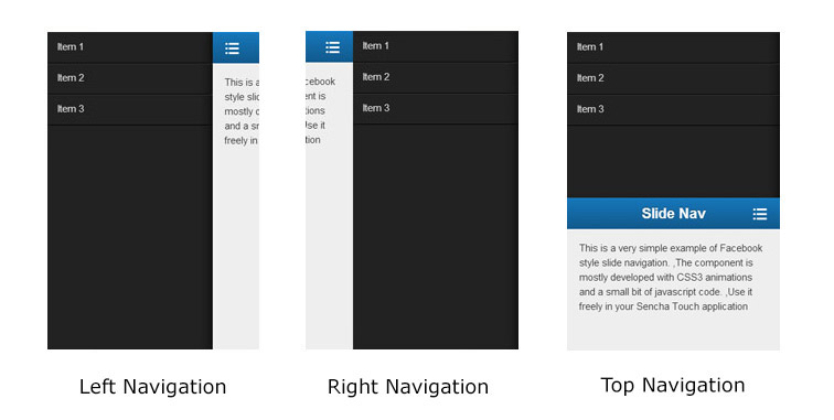
I was looking for a similar ready-made component with Sencha Touch and found a number of them (check other example links at the bottom of this post). While all these examples serve the same functionality, I found these are bit complex for a newbie to understand and implement freely in their apps. So, I came up with a dead simple Slide Navigation Menu mostly with CSS3 and a very small chunk of Javascript code. The same navigation can work as left, right and top menu. Follow me.
Lets first create a Sencha Touch project. I used the latest Sencha 2.2 and Sencha CMD 3.1. By default the generated app has a Main view which is the main container for all other panes. But in our case, I created a Viewport view which actually holds the Main and Navigation panels. This Navigation view is the collapsible panel which can be Ext.List or Ext.Dataview or any other view component.
[button link=”https://www.innofied.com/iphonetest/?url=https://www.innofied.com/blog/slidenav” linking=”new-window” size=”medium” type=”simple” title=”Mosaic Image Gallery with Sencha Touch”]Demo[/button]
[button link=”https://github.com/innofied/slidenav” linking=”new-window” size=”medium” type=”simple” title=”Download” label=”Download”]Download[/button]
Take a look at the Main and Navigation panels. Both are simple panels with least amount of items inside.
Sencha views
Navigation.js
Ext.define('SlideNav.view.Navigation', {
  extend: 'Ext.List',
  xtype: 'navigation',
  requires: ['Ext.data.Store'],
  config: {
    cls: 'nav-list',
    itemTpl: '{title}',
    data: [{
        title: 'Item 1'
      }, {
        title: 'Item 2'
      }, {
        title: 'Item 3'
      }
    ]
  }
});
Main.js
Ext.define('SlideNav.view.Main', {
  extend: 'Ext.TabPanel',
  xtype: 'main',
  config: {
    tabBarPosition: 'bottom',
    items: [{
        title: 'Home',
        iconCls: 'home',
        html: ['This is a very simple example of Facebook style slide navigation. ',
            'The component is mostly developed with CSS3 animations and a small bit of javascript code. ',
            'Use it freely in your Sencha Touch application'
        ],
        styleHtmlContent: true
      }, {
        xtype: 'titlebar',
        title: 'Slide Nav',
        docked: 'top',
        items: [{
            align: 'left',
            name: 'nav_btn',
            iconCls: 'list',
            ui: 'plain'
          }
        ]
      }
    ]
  }
});
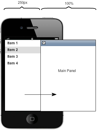
A navigation menu at left is the most popular one – lets start with that. At first we will give the Viewport container a hbox layout. The navigation menu will have a width of 250px and instead of giving Main panel flex:1, we will make it 100% width. In css, we will give the navigation menu a position:absolute and left:0; Now, if Main view’s z-index is greater than Slide nav, it will hide the slidenav behind it (check the figure). One point to remember, if your main panel is having a transparent background, do not forget to add a background to it. Else, the nav menu will be seen behind it.
On clicking nav button, we just set translateX:250px for Main menu, and the Nav menu is now revealed – hence we get what we want. The concept is that simple.
Same concept can be applied to both right and top navigation too. So, here is our Viewport container:
Viewport.js
Ext.define('SlideNav.view.Viewport', {
  extend: 'Ext.Container',
  xtype: 'app_viewport',
  requires: [
      'Ext.TitleBar'
  ],
  config: {
    fullscreen: true,
    layout: 'hbox',
    items: [{
        xtype: 'main',
        cls: 'slide',

        // Needed to fit the whole content
        width: '100%'
      }, {
        xtype: 'navigation',
        width: 250
      }
    ]
  }
});
All the views are done. We now need to add a handler for the nav button inside the controller where we will add or remove the css classes. We gave the Main panel a class “.slide”, which we will add animations with “.in” and “.out” classes.
CSS for left navigation
/* For left side navigation */

.slide ,
.nav-list {
  -webkit-animation-duration: .200s;
  -webkit-transition-timing-function: cubic-bezier(0.275, 0.080, 0.425, 0.855);
}

.slide {
  background: #f1f1f1;
  z-index: 1;
}

/* Main view */

@-webkit-keyframes slideout {
  from {
    -webkit-transform: translateX(0px);
  }

  to {
    -webkit-transform: translateX(250px);
  };
}

@-webkit-keyframes slidein {
  from {
    -webkit-transform: translateX(250px);
  }

  to {
    -webkit-transform: translateX(0px);
  };
}

.slide.out {
  -webkit-animation-name: slideout;
  -webkit-transform: translateX(250px);
}

.slide.in {
  -webkit-animation-name: slidein;
  -webkit-transform: translateX(0px);
}

/* Main view ENDS */

/* Nav menu view */

.nav-list {
  height: 100%;
  background: #222;
  -webkit-box-shadow: inset -15px 0px 30px -15px rgba(0,0,0,1);
  position: absolute !important;
  left: 0;
}

.nav-list .x-list-item {
  color: rgb(223, 223, 223);
  border-bottom: 1px solid #000 !important;
  border-top: 1px solid #333 !important;
  font-size: 15px;
}

/* Nav menu view ENDS */
We add/remove these css classes in controller’s toggleNav() method. The controller at this point has only this method. You can use this method inside any of the views also. However, because we maintain the functional part in a controller, I preferred to put it there.
Sencha Controller
App.js
Ext.define('SlideNav.controller.App', {
  extend: 'Ext.app.Controller',
  config: {
    refs: {
      main: 'main',
      navigation: 'navigation',

      navBtn: 'button[name="nav_btn"]'
    },

    control: {
      navBtn: {
        tap: 'toggleNav'
      },

      navigation: {
        itemtap: function (list, index, target, record) {
          this.toggleNav();
        }
      }
    }
  },

  /**
   * Toggle the slide navogation view
   */
  toggleNav: function () {
    var me = this,
      mainEl = me.getMain().element;

    if (mainEl.hasCls('out')) {
      mainEl.removeCls('out').addCls('in');
    } else {
      mainEl.removeCls('in').addCls('out');
    }
  }
});

And here is how the left navigation look. We can move the menu to right and top too. For right nav, we just need to change nav button align property to “right”. In css, we now have to make the initial position of Navigation view at “right 0;” which will fix it to extreme right of window. For main panel, we have the positions just opposite to what we have earlier. Find the code for this below.
Css for right navigation:
/* For right side navigation */

.slide ,
.nav-list {
  -webkit-animation-duration: .200s;
  -webkit-transition-timing-function: cubic-bezier(0.275, 0.080, 0.425, 0.855);
}

.slide {
  background: #f1f1f1;
  z-index: 1;
}

/* Main view */

.slide.out {
  -webkit-animation-name: slideout;
  -webkit-transform: translateX(-250px);
}

.slide.in {
  -webkit-animation-name: slidein;
  -webkit-transform: translateX(0px);
}

@-webkit-keyframes slideout {
  from {
    -webkit-transform: translateX(0px);
  }

  to {
    -webkit-transform: translateX(-250px);
  };
}

@-webkit-keyframes slidein {
  from {
    -webkit-transform: translateX(-250px);
  }

  to {
    -webkit-transform: translateX(0px);
  };
}

/* Main view ENDS */

/* Nav menu view */

.nav-list {
  position: absolute !important;
  height: 100%;
  right: 0;
  -webkit-box-shadow: inset 15px 0px 30px -15px rgba(0,0,0,1);
  background: #222;
}

.nav-list .x-list-item {
  color: rgb(223, 223, 223);
  border-bottom: 1px solid #000 !important;
  border-top: 1px solid #333 !important;
  font-size: 15px;
}

/* Nav menu view ENDS */

/* For right side navigation ENDS */
For top navigation, we need to do following changes at Viewport.js:
- Make Viewport layout “vbox“
- Change navigation panel’s width:250 to height:250
- Change main panel’s width:100% to height:100%, and add width:100% to Main panel’s style
Css for top navigation:
/* For top navigation */


.slide,
.nav-list {
  -webkit-animation-duration: .200s;
  -webkit-transition-timing-function: cubic-bezier(0.275, 0.080, 0.425, 0.855);
}

.slide {
  background: #f1f1f1;
  z-index: 1;
}

/* Main view */

.slide.out {
  -webkit-animation-name: mainSlideOut;
  -webkit-transform: translateY(250px);
}

.slide.in {
  -webkit-animation-name: mainSlideIn;
  -webkit-transform: translateY(0px);
}

@-webkit-keyframes mainSlideOut {
  from {
    -webkit-transform: translateY(0px);
  }

  to {
    -webkit-transform: translateY(250px);
  };
}

@-webkit-keyframes mainSlideIn {
  from {
    -webkit-transform: translateY(250px);
  }

  to {
    -webkit-transform: translateY(0px);
  };
}

/* Main view ENDS */

/* Nav menu view */

.nav-list {
  width: 100%;
  background: #222;
  position: absolute;
  top: 0;
  -webkit-box-shadow: inset 0px -15px 30px -15px rgba(0,0,0,1);
}

.nav-list .x-list-item {
  color: rgb(223, 223, 223);
  border-bottom: 1px solid #000 !important;
  border-top: 1px solid #333 !important;
  font-size: 15px;
}

/* Nav menu view ENDS */

/* For top navigation ENDS */
This is it. Hope you can use this functionality in your Sencha Touch apps. If you get any issue implementing this, do not hesitate to add a comment here. Whole source code of the extension is available for download at github.
[button link=”https://www.innofied.com/iphonetest/?url=https://www.innofied.com/blog/slidenav” linking=”new-window” size=”medium” type=”simple” title=”Mosaic Image Gallery with Sencha Touch”]Demo[/button]
[button link=”https://github.com/innofied/slidenav” linking=”new-window” size=”medium” type=”simple” title=”Download” label=”Download”]Download[/button]
Other resources:

